Air quality visualisations

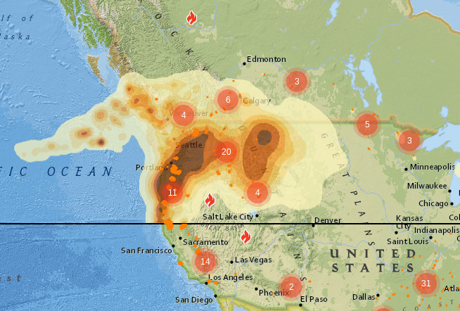
A friend reports from Canada that smoke from the US wildfires is coming over, and showed me a rather spectacular animated visualisation:
http://firesmoke.ca/forecasts/current/

image

Ignore the horizontal black line: the US/CA border is just north of the worst air.

(This link will be a lot less exciting when there aren’t raging wildfires, but right now it’s very impressive.)

2 Likes

Gratifyingly, the Luftdaten map is showing corresponding poor air quality:
(snapshot:

https://bristol.maps.sensor.community/#4/43.95/-100.32

… which kind of explains why all the sensors in Frome are showing Low: the scale has to cover quite a range.

1 Like

Slightly related, just seen Leaflet, a small open source mobile-friendly mapping library (uses openstreetmap by default)

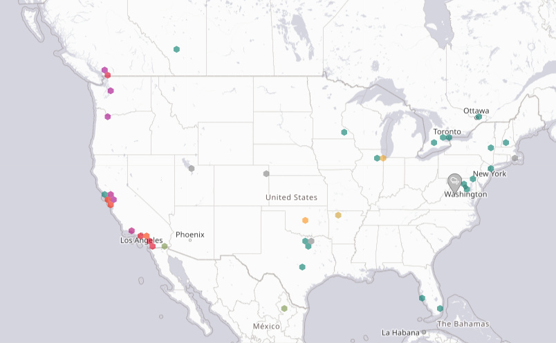
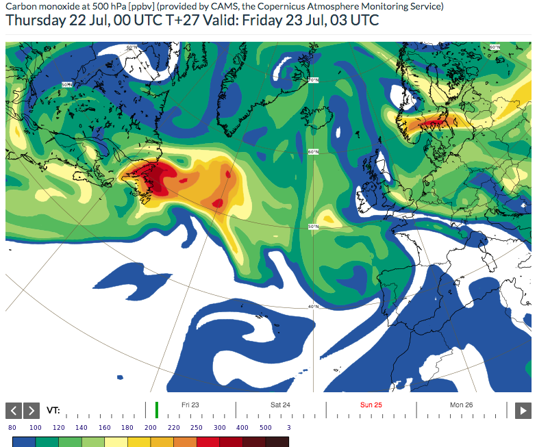
Again it’s fire season in the next continent upwind… Wildfires in Canada and the US East Coast have caused air quality problems on the US West Coast and (huge) pockets of poor quality air can even cross the Atlantic.

Here’s a site with animated Carbon Monoxide forecasts, and more.

via Mark Parrington